
My Work
Scroll to Explore!
✶
✶
SunFire Equestrian
✶ Branding ✶
Background
What did the client want?
SunFire was a freelance client who had a very strong vision for their logo. They wanted a horse jumping either in front of or through a sun with wavy rays. They also wanted an elaborate script as their primary font and a basic serif as their secondary. Their primary brand colors were a forest green and a royal purple.
What deliverables were created?
A logo, multiple icons, and a brand guide.
Deliverables*
Logo & Icons
Brand Guide
*client has since gone in another direction
✶
✶
JMU Dining
✶ Social Media & Graphic Design ✶
Background
What was my role at JMU Dining?
I was a graphic design intern for JMU Dining for the 2023-24 school year. I helped to create the digital and print materials for all 28 of the different dining locations across campus. JMU Dining didn’t have a strict brand guide and preferred the designers to approach each graphic/campaign with individually.
Deliverables
Cramcart Story
Inspired by a Metallica tour poster, I created this story to announce the times that our cramcart was going to be around campus. the cramcart is a wagon full of snacks and drinks that we passed around to students for free to help relieve end-of-semester stress.
To create this story I used illustrator to hand-alter the “c” and “t” in the title, manipulate a photo of one of the dining halls, and to arrange the rest of the text and texture.


Menu Story
Rodeo Night Campaign


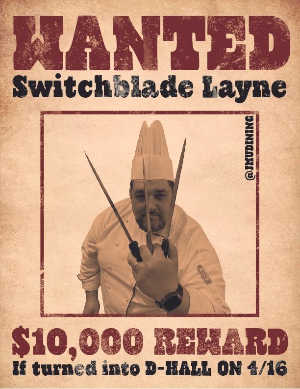
Wanted Poster (1 of 10 Designs)
Invasion of the Other Worldly Campaign
I created these two stories and digital banner to advertise an alien/space themed event called “Invasion of the Other Worldy”. I got inspiration from pop art and comics for the graphics. I made everything from scratch on Adobe Illustrator, even placing every star by hand. The menu wasn’t finalized before my time at the office was over which is why it is blank.
The building in the background is D-Hall, the dining hall where the event was taking place, and I used the traditional scene of a cow being lifted by an alien’s ufo. for the menu story, I used that same ufo idea to make it seem like the ufo was trying to take the menu. I also made sure to only place the stars around the perimeter to make sure the text, once added, would be legible.
For Rodeo Night, I was tasked with creating an announcement story, menu story, and wanted posters to use as ads around campus. All three deliverables were created entirely on Adobe Illustrator, except for the photos on the wanted posters which I edited on Photoshop.
For the announcement story I hand created the rope texture and hand lettered the word rode using that texture. I also used that rope for the border of the menu, and created the knot at the bottom.
The silhouettes on the story feature a cowboy trying to wrangle a bulldog wearing a crown and cape to resemble our mascot, Duke Dog.
For the wanted posters, I used pictures of the dining staff and had them come up with fun nicknames to use on the posters. We wanted them to be fun, recognizable, and to have the date and location displayed in a unique way.
Announcement Story
Announcement Story
Menu Story
Digital Screen

✶
✶
Bluestone Communications
✶ Social Media & Copywriting ✶
Background
What is Bluestone Communications?
Bluestone Communications is James Madison University’s student-run public relations firm. The firm was made up of 35-40 students each semester. They were split up into 3 teams that each serve 2 clients. The clients applied to be taken on by the firm each semester could be non- or for-profit organizations within the Shenandoah Valley.
What was my role at Bluestone?
I served as a co-creative director for the firm meaning that I oversaw all creative deliverables put out by the firm as well as helped to create all of the graphics that promoted the firm.
Included Deliverables
A social media rebrand & monthly newsletters
Deliverables
Social Media Rebrand
We chose to rebrand the social media due to its over-reliance on graphics and templates and the overuse of dark, harsh colors. our rebrand included three essential pieces. Through these tactics, we were able to increase our social media engagement by about 30-40% each month and our reach by 100-150% each month.
Increased the frequency and diversity of the media we posted
We posted consistently 3 times a week - each Monday and Friday post had a new topic such as a workshop recap, reel, or client shoutout.
Expanded the color palette to include 3 new pastels
By doing this, we were able to use Bluestone’s iconic neon colors as more impactful accents
Increased the use of photography
We utilized our headshots and group photos as well as making sure to take photos at class and other firm bonding events
Feed Overview (as of 4/30/24)
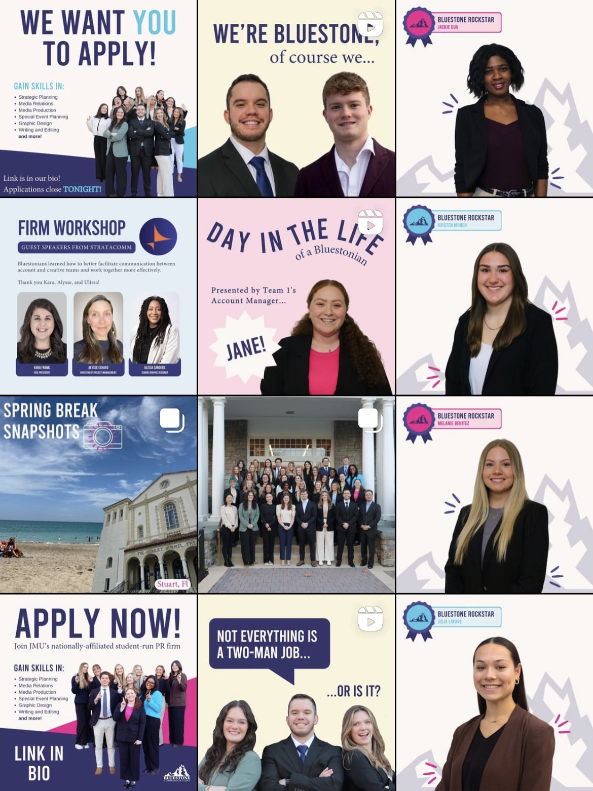
A Closer Look at Posts I Created


Monthly Newsletters
I created the copy and designed the firm’s monthly newsletters. They were distributed, through email, to the College of Arts and Letters’ faculty, Bluestone’s professional advisors, and to the School of Communication Studies’ students. I made some improvements to the newsletters including:
Being more intentional with and utilizing consistent branding throughout the newsletters
Using more dynamic and visually intriguing layouts